The Evolution of Kits Part 2

The early 80’s saw the introduction of UHU as a new sponsor, married up with the classic Adidas look. The kit itself was designed with a huge collar that really stands out on the shirt, along with the sponsor in big black letters. This era of kits was interesting because of the red and white away kit; something that you don’t often associate with Borussia Dortmund.


The 1982/3 season saw BVB go for a pinstripe affect, I think you can agree with me that it is a very pretty shirt. You see that the shirt itself went back to a classic adidas style with chunky sleeve cuffs and a thick v-neck collar, both in black. With the inclusion of the big BVB emblem above the heart and the subtle pinstripes, it give the shirt a touch of class.

The following season saw a change in sponsor and manufacture; Pony and Artic Eiskrem. They followed suit with the pinstripe affect, however, the gigantic black horizontal stripes and the large collar in my opinion look out of place. Just a black collar without the horizontal stripes would have been much better. Sometimes less is more.

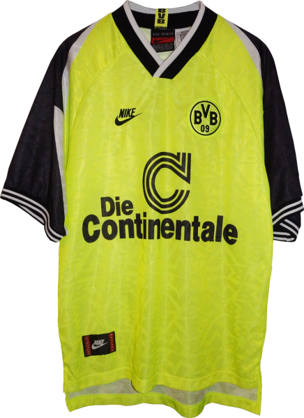
The later 80’s saw a shift back to Adidas and once again a change of sponsor, Die Continentale, a name that will be remembered later in the future. This period in time saw more and more teams getting more adventurous with their shirt designs, Dortmund were no exception. The diagonal pattern adds layers to the shirt, giving it a certain edge over just a plain yellow one. The upper yellow stripe on the black collar and cuffs also adds a little something to the shirt. Individually they may not seem that big of a deal, but aesthetically they blend in perfectly with the diagonal pattern. The same style continued with the away jersey, once again, like through most of the 80’s a red and white kit.


A similar thing going into the 88/89 season, where both kits went for an identical pattern, this time though the pattern was more like arrows. That alone as a pattern might have been enough but what give the shirts that little extra character is the use of gradients. Within each section of the pattern there are individual shapes, within those shapes are the clubs main colour use for that shirt. That colour then fades to a lighter version until it reaches an off white. this gradient is very eye catching and at the time something very revolutionary in terms of football kits.


89/90 season saw a bit of a change; the classic three Adidas stripes had disappeared, something that we weren’t used to with Adidas shirts. The huge black panels on the sleeve try to give the shirt a little something, personally I think it needed a little more black and instead of panels I would have preferred a all black sleeve. What I do like though is the slightly lighter yellow vertical stripes, giving the shirt a shiny look making it more easy on the eye.

The 90’s saw the introduction of more flamboyant and more eccentric kit styles and colours, as detailed in the 90/91 season. Taken over the manufacturing was American sports giant NIKE. The trademark swoosh across the right hand side of the chest stands out much more than the smaller Adidas one. Marked with the huge black triangles that come in from the shoulders. The yellow itself has gone more fluorescent, with a very minor pattern to give it the extra glimmer in the light. The white collar is slightly out of place here and I feel a black one would have fit more with the style.

The next season saw a continuation of the florescent look but this time it had different sleeves. One can only describe the pattern as ‘broken glass’, but you know what, it actually works. The reason I think it doe is because they went for a more suitable collar, out with the white and in with a yellow and black to fit the profile.

The early 90’s saw year upon year manufacturers becoming more and more adventurous with their kit branding designs. These next few Dortmund ones are just some examples.


Once we got past the mid 90’s things started to calm down a little (I say that loosely). This style is much more my cup of tea in terms of its traditional look; yellow jersey, black collar and sleeves, small detail on the collar and cuffs and nothing else to fancy.
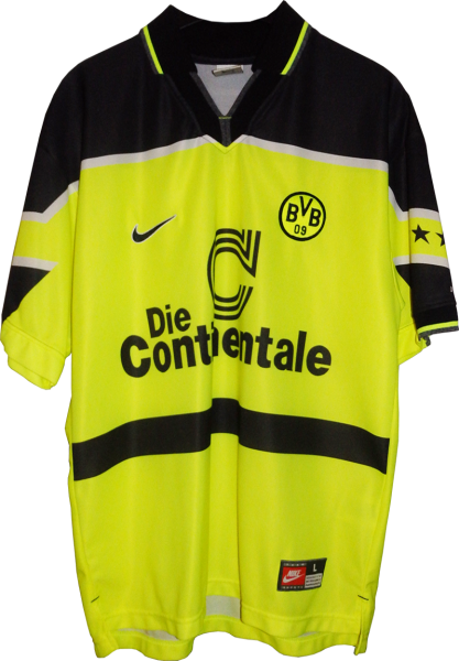
Now the 96/97 season obviously for every Dortmund fan is a sacred year, due to the fact they won the UEFA Champions League. The kit used in the final saw the main shirt sponsor adapt their logo and sitting in the centre of the shirt just fit so well. The thick black area over the upper chest, shoulder area running down the arms optimised the iconic Borussia Dortmund look. The CL variation kit in my view looks even better. the vertical stripes adapted around the centre ‘C’ look excellent. You can see how future designs have taken inspiration.

As we head towards the turn of the millennium you see that NIKE have adjusted their brand. The name itself has been removed and now just the swoosh, itself has had a touch up. The colour yellow has returned to Dortmund’s more natural colour and in addition a change in sponsor. The golden yellow brings back the historic look for the club, this time with some white side panels, something that hasn’t appeared so far on the club jerseys, especially in white.

A nice conclusion during this period, part 3 will be looking at how the kits have adapted since the year 2000.