The Evolution of Kits [Part 1]
![The Evolution of Kits [Part 1]](https://www.borussiadortmund.co.uk/wp-content/uploads/2017/06/throwback-thursday-bd.png)
When you think of Borussia Dortmund the first thing that comes to mind is the famous yellow jersey. These days its all about who the manufacturer is and what company will be sponsoring them next. That is all part of the modern era of football; sponsorship = money. This series will look at the evolution of the famous yellow jersey,how they have developed over the years and how modern sponsorship has influenced them.
We start back in the 1950’s, where BVB were playing in the Oberliga West; a regional division long before the Bundesliga came about. The striking yellow prominent in contrast with the black sleeve cuffs and collar. The unusual laced collar, giving the shirt real character, could you imagine a collar like that on a shirt these days? One thing that is clear though is the lack of branding, sponsorship and even club emblem missing. The club had their proud BVB logo, but anything on the shirt besides a number on your back was deemed as unnatural. The yellow in Germany, was enough for people to know who it was for.

In 1955/56 season the style of the shirt changed slightly. The continued focus of that sharp yellow with the contrast of black on the collar and sleeves. This time though the sleeve cuffs were much much smaller, just as a round off to the sleeve, rather than the large, striking cuff from the previous years. The collar itself had transitioned into a more fashionable V-neck, still thick and black, but looking more like an everyday shirt. This kit is pretty special for the club as it was worn when BVB successfully won the 55/56 German Championship and retained it the following year, the first time in the clubs history.

Over the next decade the shirts all looked pretty similar, ranging from a round neck to a V-neck collar, but it was the 1968/69 season that saw something new appear on the shirt, something that the club hadn’t used before. Going back to the thick banded cuff and a tight black round collar, the shirt itself included for the first time it’s manufacturing logo, Erima. Now, the logo itself was stitched in yellow, so it isn’t the clearest of logos, but it was the start of things appearing on a football shirt. Interesting though that it appeared before the BVB logo.

Up into the 70’s Erima continued to make Dortmund kits, but in the 1974/75 season, saw the turn of the iconic style jersey. A brand that has nowdays become a giant in the football world, that brand of course is Adidas. The shirt itself looks pretty similar to the Erima shirt of the late 60’s, the only difference, the iconic three stripes down the sleeves. Those three stripes were and are the iconic football shirt sponsor. If you were to sit there and think of a football kit design one of the first images you think of is this original style. With the small Adidas logo on the right of the chest and a slightly tight fit, this kit oozes class. If I have to choose a favourite, this has to be it, it’s traditional but exceptional with minimalistic beauty.

The 75/76 season saw a slightly different approach, the style of the kit stayed more or less the same with the exception of the Adidas logo being a touch darker. However, we now see the introduction of BVB branding, not so much the use of the clubs emblem, but huge branding to show of Ballspielverein Borussia 09.

With club and manufacturing branding starting to appear more and more on football shirts, it was only a matter of time before companies saw the opportunity to use football as a marketing tool. Cometh the era of the shirt sponsor. Samson became the first shirt sponsor for Dortmund, something that seems so natural in this modern era of football, back then though it was different. If a club today was to appear without a sponsor it would seem quite odd and out of place (I actually prefer them without one). Adidas continued with the iconic approach but faded the logo, however the shirt sponsor wasn’t the only thing to appear. After the bold branding of BVB, the club decided to stick a huge emblem on the opposite side to the Adidas logo. The big dark sphere standing out on that bright yellow jersey.

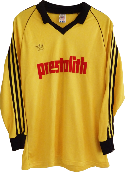
After a few years with Samson, Dortmund signed with a new sponsor; Prestolith. Still manufactured by Adidas, but notice how the becoming giant of the sports manufacturing world change their style. Still their logo and three stripes are appartent, but look at the collar. For the first time we see an actual folding collar. Still a thick black band adding to the contrast in the yellow, the collar gives the shirt that something different. The red of the sponsor just diverts the eyes towards it, an excellent marketing tool compared with Samson’s black logo just blending in.
Overall the variety in these shirts over the three decades we have shown is very minimal. Aside from a variation in the collars, which seemed to be on a 2/3 year cycle, not much else happened. The introduction of the manufacturing logo was one of the main changes during this period as it gave the shirts a unique identity compared with just the plain look. As we transition into the 80’s and 90’s in the next post, that’s when we see the really variety start to unravel.
All images courtesy of https://www.bvb09trikotsammlung.com & http://bvb-trikotgeschichte.de