The Evolution of Kits [part 3]
![The Evolution of Kits [part 3]](https://www.borussiadortmund.co.uk/wp-content/uploads/2017/06/throwback-thursday-bd.png)
In part 1 and part 2 we looked at some of the quality and not so quality kits that BVB had on display. The 70’s had some really classy simple kits, whilst the 90’s was throwing together anything and looking like we’ve woken up the morning after a rave. Now it’s the turn of the millennia and time for a new wave of football kits to emerge. Borussia Dortmund are about to enter a mind blowing decade on two completely different extremes.
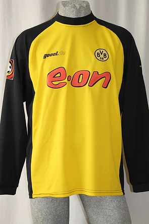
The year 2000 took a step back from the crazy highlighter pen kits and into the era of ‘modern’. Dortmund had lost it’s high brand kit manufacture NIKE, and instead been replaced by ‘Goool’. What is also different is the big red e-on sponsor bang in the centre of the chest. What is important about this kit is its transition back to the vibrant yellow as apposed to the luminous one a few years before. What is also different is the decision to go with big bold stripes throughout the entire shirt. The black and yellow contrast was back; a good decision in my view.

The following season saw the messiah achieve the ultimate dream; Matthias Sammer led BVB to it’s first Bundesliga title since the 97 season. They were almost UEFA Cup winners that same season, so this kit is also another one that will stick in many fans minds. It has a simple look, branding is the same but the stripes have been removed and replaced with full black sleeves and sides. It is a match made in heaven.
2002/2003 was one of my own personal favourite kits, the trend now is to always improve on the previous year and sometimes being simplistic gives you so much more. Who would have thought that a yellow shirt with a thick black stripe across the chest would look so great. Well, that’s all it is, simple but incredibly effective.

2003/04 saw the simplicity go one step further, a remake of the classic 1970’s style shirts, this time with sponsors.

2004/05 and time to reintroduce the love affair with American sports giant NIKE. Still sponsored by e-on, the club went with a style that NIKE had used all around the globe. Something that many manufactures do even now, they use the same template throughout all the teams they make kits for. The simple black trim going around the shirt like a border, with that traditional swoosh up on the right collarbone.

2005/06 saw the introduction of the strip, this time it was one large vertical stripe down the centre of the shirt, resembling Ajax. What I like about this is the gap in the stripe so the sponsor could fit in and also how bright that Champions League star stands out on the black.

2006/07 saw the club enter extreme financial difficulties, they had been apparent over the last few seasons but really starting to take its toll on the club. The whole essence of what the yellow shirt meant to the club, its fans, its history had left when the club announced this as their kit. Why white? That is the question I’ve continued to ask, the answer is i dont know. My only guess would be it was a marketing plan to get more people to invest in the new colour scheme.

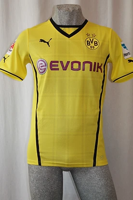
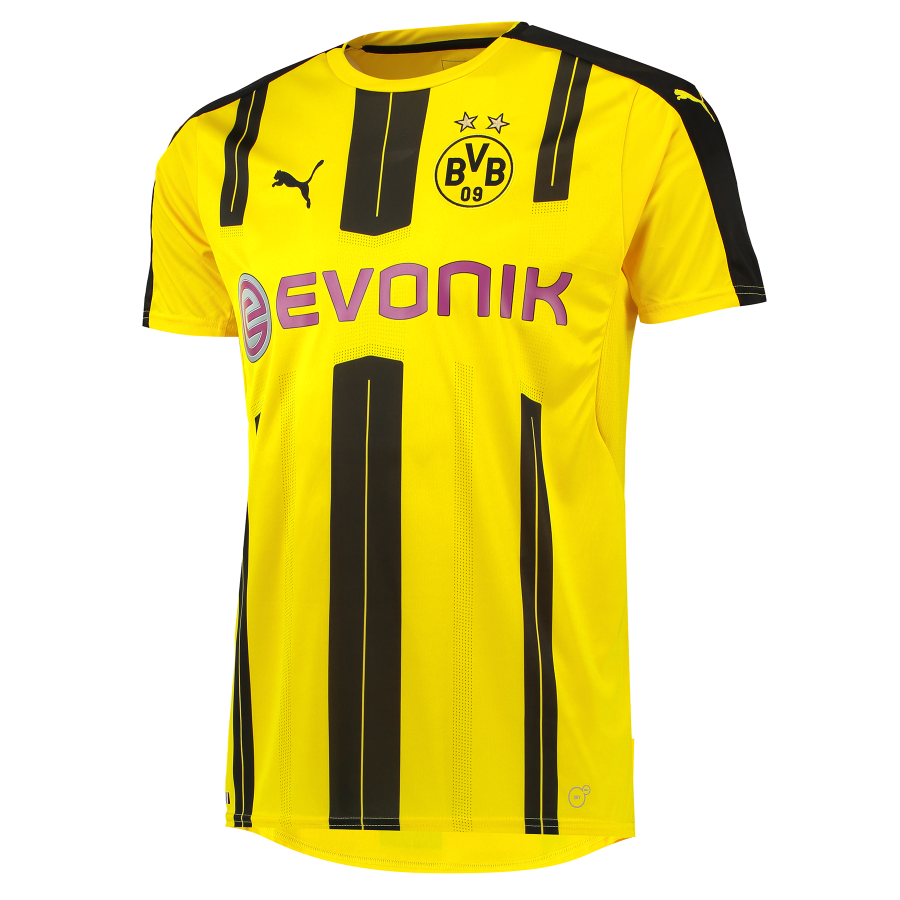
2008 saw the introduction of a new sponsor, EVONIK and has lasted all the way up to the present day. I personally like the whole 50/50 look, but there is something that just doesn’t quite fit. Maybe it’s the white background behind the sponsor, or maybe its just a big change once again from the yellow and white.

2008/09 and the modern era takes its next turn, now kits are becoming tighter, more technology is going into the heaviness and materials used in a shirt when players wear them. How aerodynamic are they? How light are they? Can an opponent grab hold o it easily? These are all the questions manufactures are asking themselves when designing these kits. The subtle look with the classic effect just with added pinstripes is great. The white background has been removed from the sponsor and the shirt itself just looks great.


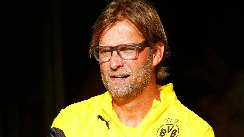
2009/10 and as we escape the naughties and enter the teens the deal with NIKE ends, up steps Kappa. This kit is simple, nothing fancy, just yellow with a black trim around the body. It’s nothing special but nothing bad either. The away kit though is something completely different, looking like rays of sunshine beaming across the black shirt, beautiful. Throughout the Klopp era, when he put the club back on the German and European map, the kits became more and more modern, with an edge and creative. Aside from the few occasions when they reverted back to a simplistic style, they went for variety and thats what they got, even into the Tuchel era.


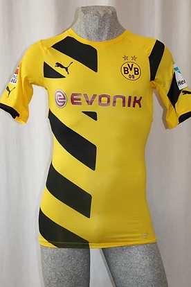

Even now as we enter a new era with Peter Bosz, the kit j=has taken on another new intuitive way to look modern and stylish. The black horizontal stripes with its gradient, fading from black to yellow on opposite sides is beautiful. I wasn’t so keen on it to begin with, but the more and more I look at it, it looks like a work of art. Hats off to Puma for this one.

So that brings us right round to the present, looking at the legendary kits all through the clubs past. Some will be remembered forever, some will be thankfully forgotten. I wonder what the future will hold for kits as we edge closer to the 2020’s.
All images courtesy of bvb09trikotsammlung.com, bvb–trikotgeschichte.de and www.bvbonlineshop.com